Wednesday, December 29, 2010


This busy, professional young couple gave me a call when they moved from the city to the suburbs. They bought a lovely home with a family room off the kitchen. The family room is situated about 6 stairs down from the kitchen and, as with just about every house I know of, the kitchen/family room would be the hub of the home.

Their goal for the room was to have plenty of seating for entertaining and plenty of storage to accomodate their 18 month old's stuff. They wanted the room to be comfortable and attractive but not formal or stuffy. Their aim was not to make a focus of the TV or have it look like a toy room with seating for mom and dad.

We first addressed TV placement. While the Mrs. did not want the TV to be the focus of attention, it only made sense to me that to place it where it could be seen from the kitchen as well as the family room would serve them well for the gatherings they like to have when the Bears, Bulls and Blackhawks are playing. Lots of seating was easy-a sectional and two comfy chairs fit well into their room size. We gave the idea of storage some thought and found this wonderful storage console which holds their TV nicely, but still commands it's own attention. We added further storage but using a cocktail-ottoman which has a lift off top. To warm the room up, we added a floral fabric at the large window and some shades for both light control and privacy.

I think we hit all marks here. The room fulfills all of their needs for seating and storage and looks warm and inviting. Nice job!

Friday, November 19, 2010

What's black and white and pink all over?


This was a fun project using products from Pottery Barn. This teen spotted (no pun intended) the black and white floral rug while walking through a model home. It was just the thing she was looking for as a place to start in her bedroom redo. Her mom gave me a call to see if I could help pull the whole thing together. We picked a pretty pink paint color which was applied to both walls and ceiling. We then ordered up the Pottery Barn rug and bedding. We also used PB's black and white dotted sheets turning them into cornices and the window seat cover. We did some accessory shopping at Hobby Lobby, Target and TJ Max and pulled the whole thing together in a matter of a couple of hours. The outcome is pretty fun and hip for a 15 year old who'd been living with Laura Ashley for 13 years.

Tuesday, August 17, 2010

Downsize and Modernize Part Two


Part One under Downsize and Modernize talked about my clients living room. This entry is the same client and is about her kitchen. As you will see from the 'before' pictures, she had a very 80's oak kitchen. She wanted to modernize it and again didn't want to 'break the bank.' There really wasn't much room for changing the layout, so we kept that the same, but modernized it with bright white cabinets to the ceiling, gorgeous granite countertops in a color/finish called Taupe and added some stried mini brown glass subway tiles. The little bit of wall space there was we painted brown and added kiwi green accessories to keep our green/taupe/brown color scheme consistent with the living room. We love it!

Downsize and Modernize Part 1


Recently a client of mine purchased a nice but outdated townhome. They wanted to do some renov ating but did not want to go too extreme and custom because they were not really sure how long-term their stay in this home was going to be: might be two years, might be twenty. They wanted to live there for a while and see how they felt about it. My job was to update it without breaking the bank, and also to reuse furniture that they already owned. They were willing to invest some money in updating window treatments and some minor reupholstery, but basically they wanted to keep the investment as small as possible due to the uncertainity of the length of their stay in this home.

I love a challenge, so after taking inventory of what they owned, I put together a new color scheme and chose the pieces we would use. I decided to nix the 80's white shelves in the living room but decided to keep the shutters. We removed the wallpaper and repainted the walls and recarpeted the floor. In addition, we added new drapery panels and reupholstered the window seat, pillows on the sofa and backs of the two pull up chairs.

We made this room serve triple duty as the 'formal' living room, desk area for the Mrs. and comfy TV area for when someone wanted to watch something other than what was on the family room TV. We wall mounted an LCD over the desk area but out of eye-shot from the entry or dining area.

I think we did a great job in pulling out a NEW look and multi purpose space without 'breaking the bank.'

Sunday, July 11, 2010

Just a little something-something adds a fresh new look!


Sometimes we get so used to seeing our house the way that it is we just can't imagine what we could do to change things without either painting or buying more new stuff. This client is building a new home and doesn't want to make any investments in new things for her old house, yet she needed a 'freshening up' because her son is getting married soon and she will be doing a lot of entertaining. I didn't bring a lot of 'things' with me but I did bring a much needed fresh eye.


The first room that needed some serious 'weeding out' was the family room. She had a few things that were too big and a lot of things that were too small. We moved the gigantic tree from one corner of the room (which happened to be the one corner of the room that you could see from everywhere else in the house) to a less conspicuous corner freeing up tons of light and space, giving the room a much grander and more open feeling. Then we removed all of the little bric a brac from the fireplace mantel and the coffee table, hung the mirror over the mantle rather than leaning it, and added just one 'important' piece on both the mantle and the coffee table, creating a simple yet elegant feel.


In the powder room, we added a rug, new towels and repurposed a more appropriately sized piece over the storage unit. We hid the cord of a repurposed lamp and added a couple of little knick knacks from her 'recycle pile' from the family room.


In the dining room we added a more appropriately sized piece of art (formerly in the living room) to the right of the hutch, brought in a cute tiered garden cart with 'recycle pile' pieces of greenery and pottery, streamlined what was on the open shelves of the hutch, brought in a new centerpiece for the table as well as custom greenery for the wall sconces on either side of the bay window. Oh! And got rid of the old and dusty ficus tree.

Tuesday, May 4, 2010

Before and After


Here's a pretty straightforward 'before' and 'after' shot. Mom, in this case, wanted new seating and new colors. Against the wishes of her family she opted to sell the old sectional (soooo comfy by her family's standards) and get a new set up with sofa, loveseat, table between and large coffee table with storage that she really wanted. I understand the kids aren't that happy, but Mom is thrilled. She feels confident that everyone will eventually come around.


Friday, April 9, 2010

Lightening Up An Olde Favorite


This LaGrange Park home is an historic victorian lovingly restored by it's owners over the last 25 years or so. This home has been through many renovations and redo's including stripping the paint off of all of it's interior moldings to reveal its original oak, redesigning the kitchen to have modern conveniences but hold onto it's old world charm, updating bathrooms, screening in porches and most recently lighting up the colors used in it's formal living room.

About 20 years ago these folks called me in to choose colors and fabrics for a first go around at pulling their first floor together-kitchen, dining room, living room and family room. At the time, 1990 or so, the couple had two small boys and green leather sectionals in their family room and a collection of family antiques in the living room and dining room. We went with the very popular color scheme of the early nineties-greens and burgundies.

Now, twenty years later, the green leather sofas are long past their prime and some of the antiques have been relegated to bedrooms. We've kept the original rug, entry wallpaper and the settee in the living room but we've lightened up the walls, changed the window treatments, bought 'new' antiques and recovered all of the furniture. The over all effect is one of lightening up and comforting up by getting a few new pieces that are comfortable yet traditional.

Thursday, March 25, 2010

Still seeing RED....but in a good way.

Some people and some projects are just a lot of funand this client and her project proved to be just a joyfrom beginning to end. First off, this client had areally good sense of humor about the apparent need for a redo in this living room. She knew that it wasn'tworking, but it was the Living Room and, really, who cares about those? But it IS the first room thateveryone sees when they come into her home andthe kids are getting older and the kitchen and deckhave been redone, so why not give a facelift to theroom everyone passes to get to the rooms they really live in?

I love projects like this because there is no way I can fail. I'm not trying to be mean but, well, look at the pictures. Luckily, there was nothing in the room she wanted or needed to keep. The main priority for the redo was to have it look new, fresh, updated, pretty and to give her husband a comfy seat in which to play his guitar-away from the family room.

She gave me a lot of leeway and a lot of trust. I pulled together some fabrics and we were off and running on our way to a whole new look. Despite the fact that there was a lot of furniture in the room before, it's really not a very big room. I downsized the scale of the furniture by quite a bit, added some interesting pieces, gave her a bit more seating and a one-two punch with a leaning mirror (to open the room) and one huge flower print for POW.

We think the overall effect is pleasing to the eye yet also so comfortable. It's traditional yet it's hip with the flower power print and the polka dotted bench.

Wednesday, March 10, 2010

Loving Living in the Living Room


This very special client of mine is one that I've been working with since I first began designing 20 + years ago. She and her husband have consulted with me on many, many projects over the years and this particular project is one that I've been waiting for them to do for years. THE LIVING ROOM! That room in the house that no one ever, ever uses unless it's Christmas or they are having a Graduation party.

In this case, we had given the room a lick and promise more than once over the years-including the construction of the beautiful mantle and bookcases that you see in this before photo. (Mr. Client, in this case, is more than just handy. He happens to be a very talented woodworker, as well as painter, wall-paper hanger and as of this year, layer of hardwood floors). But despite the beautiful built-ins, it remained a seldom used room and the furniture, brought from a previous home, never really seemed to be just quite right.
At the beginning of 2009 this couple decided that it was time to turn a never used room into an active part of their home. How would we accomplish this? One word-TV. They made the decision to put a television in the room. That, and add beautiful new french doors going out to their gorgeous new pergula covered deck.
All of Mr. Client's sweat equity: hardwood floors, paint, new french doors, electrical work (including the lamps over the sectional), and new brown marble surround coupled with the beautiful new furnishings, art, and area rug (Can't forget the star of the show- FLATSCREEN TV) combine to make this a warm, serene, subtle and inviting space. After more than 20 years in the same home they've gotten a new addition without adding anymore space. Maybe it's time more of us start finding a use for that seldom used room in many of our homes.

Monday, March 1, 2010

A lot of old, A bit of new, some rearrange=BIG CHANGE


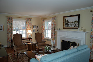
This client called me looking for an update to her outdated living room. She did not want to buy new furniture, but was willing to invest in drapery and an area rug. She donated the peach colored chairs and window coverings, as well as a couple of lamps that were screaming 1975. We rearranged the furniture that she was keeping to emphasize the fireplace and we borrowed the buffet from the dining room (giving that room a much more open feeling). We painted the room a fresher color and added floral drapery panels as well as a patterned rug. The only other thing we purchased were the new lamps on the buffet. In the built-in shelving we displayed some collectibles left to her by her mother which were very sentimental and important to her. This client was very happy to have gotten such a different look without having to invest in all new furniture.


Thursday, February 25, 2010

Florida Master Bed and Bath Facelift

This client last decorated her master bedroom and bathroom 30 years ago when she bought her condo on the Gulf coast of Florida. It was time to lighten, brighten and modernize her outdated and drab master suite. She was looking for something totally different, bright and cheerful. These pictures show the drastic difference from old to new.


Friday, February 5, 2010

A Little Bit of Retro

This family home in Winfield got an updated living room in 2009. We did something for this client a little bit different from most of their 'traditional' neighbors. The client was drawn to modernistic art and clean lines and was looking for a soothing living room. We accomplished this by giving her tranguil chocolate walls, cream colored sofas and area rug and just a few accessories of glass. We added a little ZIP with a patterned chocolate and cream drapery fabric. The effect is both modern and soothing and the best part of it is that this living room is not like every other on the block!

Thursday, January 7, 2010

Welcome to 2010

Well! Happy New Year! Turns out that last year was a pretty good one for Plzak Interiors. Despite economic reports to the contrary, there were actually people out there spending money and, happily for us, some of the people who were willing to pump some cash into the economy did it with us. We were all over the place: Sarasota, Fl., Naples, Fl, West Palm Beach, Fl, the western suburbs, the northern suburbs, the Gold Coast. We had big projects and small projects. Many of them have been completed and others will be complete as of the end of this month. Our (and by 'our' I mean 'my') goal this year will be to bring to you a series of 'before' and 'after' photos from the projects we had fun doing in 2009.


As always I have to sincerely thank all of my clients for trusting me with their projects and for being, for the most part, so enjoyable and easy to work with. I hope to have many more projects coming up in 2010 and look forward to working with both old and new clients.


The first post of 2010's series of Before and Afters will start with a family room redo which was a 2008 Christmas gift from husband to wife. These clients were looking for a more refined look for their family room-less country and more traditional. They were hoping for more lighting and more seating and they wanted to keep many of their accessory pieces and carpeting.

We gave them what they were looking for by adding two new sofa's and a bench surrounding a large storage coffee table. We also replaced an oversize chair with a swivel chair and ottoman.

We gave the room a more elegant look with solid colored drapery that covered a lot of the wall on the window walls. We added more light by hanging a bowl shaped chandelier on the ceiling and two wall hung lamps on the wide muttons between the windows.

We think the overall effect has accomplished all that they had hoped for and, the best news, they thought so too!